The Project: A common question I receive is "what color shade of 24 cent stamp do I have?" I am hopeful that I can create a decent online reference to help others come closer to identifying the various shades of this issue. Watch this progress indicator to determine how certain I am that things are approaching a final draft:
Last Updated:
Dec 1, 2019 - post is IN PROGRESS, facts being verified. Major changes likely.
But First: I do NOT pretend to be the foremost expert on shade identification. If you want more certainty, go with the
Philatelic Foundation and get a certificate. On the other hand, I have been collecting this issue for some time now, so I am fairly good at identification.
One of the difficulties I have had with writing this blog post is that
most of my work with shade identification are many years in the
rear-view mirror. Since that time, I have focused much more on the
postal history aspects. While I still have a good ability to identify
these shades, I have forgotten some of the conclusions I had reached at
the time I started writing about this (early 2000's) and I don't always quickly recall the sources. That means I have to spend some time working on my nomenclature and tracking down reliable resources so I do not mislead anyone. As long as the "Last Updated" reads "In Progress" you should assume that I am still not quite comfortable with how the content is presented. Even if it says "complete" you should assume I am still seeking to learn and may find something else that requires I modify this work.
Scans Are Difficult for ID: And, before you get too certain about what you have, let it be known here that scans are notoriously bad for certain identification.
And, finally, don't fool yourself: Why does a steel blue have more value than a lilac shade? One reason is that it is more difficult to find a solid copy of one. So, if you have a 24 center that 'sort-of' looks like a steel blue, it probably isn't. That doesn't mean you shouldn't check it out (or have it checked out). Still, when in doubt, assume the more common variety.
 |
| click on the image for a closer look |
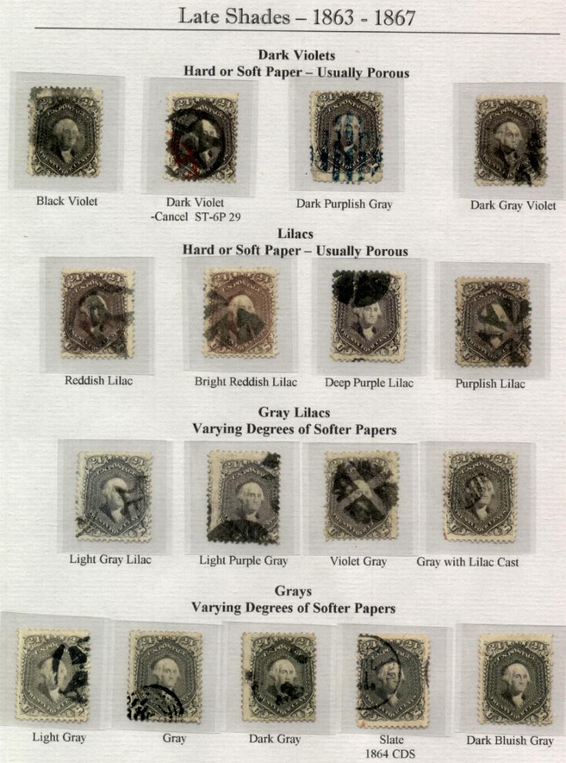
The 24 cent 1861 is known for its wide range of shade categories and collectors of classic US stamps are always hoping to acquire an example of each category as described by the Scott catalog. The Scott catalogue relies on a fairly small number
of shades for the 24 cent denomination of the 1861 series. It is my opinion
that this does not do the possible shades of this issue justice, but then again, I am a specialist. Specialists tend to make things more complicated than the rest of the world wants it to be! This issue is also prone to a good deal of color change over time,
which can render judging color difficult.
The scan above is a selection of items from my collection (or items that were in my collection at some point in time). I selected several years ago and created this image because they seemed to provide the most contrast to illustrate the general characteristics of some of the color families. I know the first four items have certificates. I am not so certain about the Blackish Violet anymore and I know it does NOT have a certificate.
Scott Catalog's Classifications
The following are from the 2010 Scott US Specialized:
#70 Red Lilac - earliest known use Jan 7, 1862
#70a Brown Lilac - earliest known use Feb 5, 1862
#70b Steel Blue - earliest known use Sep 21, 1861
#70c Violet - earliest known use Aug 20, 1861
#70d Pale Gray Violet - earliest known use Sep 10, 1861
#78 Lilac - earliest known use 1862 (looking for this date in my notes)
#78a Grayish Lilac - earliest known use Oct 23, 1862
#78b Gray - earliest known use ?
#78c Blackish Violet - earliest known use May 1, 1863
#99 F grill - Gray Lilac - earliest known use Jan 5, 1869
#60 is now listed as a 'Trial Color' in the catalog. If I find time, I'll discuss this particular shade.
About the Printings
Identification of Scott catalog identifying numbers is NOT just about color. I think the catalog designations are more about PRINTINGS that have characteristics of shade, paper and printing quality even though this is not made clear in the catalog itself (unless more recent versions than my 2010 Specialized have rectified this). I have not made it my business to study why the 24 cent stamp has been cataloged as it has (perhaps I should?). But, you can have a stamp that seems to you to look a lot like a rare shade, but if it does not fit paper and print quality characteristics, you will be disappointed to learn that they do not qualify for the variety you were hoping to find. Simply put, ink color is a flimsy separator for a family of shades that are as fugitive as these can be.
Some time ago I was gifted with some information that Richard Frajola had in his files. He could not recall the author, but he knew that the data was compiled
from works by Hollowbush and Perry. The claim was that there were nine
printings as follows:
#60 violet - 20 Aug 61 to 1 Jan 62
70b steel blue - 1 October 61 to 22 Aug 63
70 red lilac - 7 Jan 62 to 25 April 63
70a brown lilac - 11 Feb 62 to 25 Aug 65
78 lilac - 20 Feb 63 to 21 July 66
78c blackish violet - 25 November 64 to 29 June 66
78a grey lilac - 10 Nov 65 to 21 Oct 69
78b grey - 25 July 65 to 5 Dec 69
109 deep violet 1875
This is quite interesting, but I am not certain whether it corresponds with all certified examples, nor am I certain that this data is infallible. Take it with a grain of salt and maybe (someday) I'll get the energy to pursue this further. On first blush, there are already issues of nomenclature. These can't be dates of printings if the earliest known use of a violet is August 20, 1861 and that is the same date as a 'printing.' You'll also note that the EKU (earliest known use) of the steel blue (Sep 21, 1861) is also prior to the first printing (Oct 1, 1861) shown on the list above.
Nonetheless, our current methods of classifying stamps come from the early work of students such as Hollowbush, Perry, Ashbrook, Brookman and others. They made observations regarding color that we probably cannot replicate with the changing nature of the inks over time. The hard part for us is finding a consistent AND accurate definition and then maintaining the consistency from generation to generation of students and collectors of philately and postal history.
About the Paper
Thinner paper was used with the earlier printings
of this issue, the Violets (
70c and 70d) were produced in the earliest 1861/62 printings.
This paper can be so thin as to remind one of "india" paper, though not as
fragile and prone to wrinkle.
Red Lilac (
70), Brown Lilac (
70a) and Steel Blue (
70b) type shades occurred only in earlier
(1861-1863) printings and occur on paper that is thicker than 70c and 70d, but thinner than most later printings. The paper is typically whiter than later printings and is often a higher quality.
The Lilac (
78) and Gray shades (
78a and 78b)
were almost exclusively on thicker paper, sometimes with a yellowed appearance. The Scott 78 shades encompass all printings from late 1863 to 1867 (my opinion). The quality of the paper can often be inferior to the earlier printings. This is NOT to imply that the quality of the paper was extremely poor, it is simply a matter of comparison.
Determining Paper Type:
Hold the stamp up to a stronger light with the
design side facing the light. If you can clearly see the design through
the paper, it is likely that you have a stamp on thinner paper. If the
paper appears more mottled and you can't see the design readily, it is
likely a thicker paper (and thus a later printing). The very thin paper
of the violet and pale gray violet is extremely easy to see through and
there will likely be little doubt in your mind if you compare the paper
to other stamps of this issue. The image of the stamp will almost appear
as if you are looking at the design in a mirror; it will be quite clear.
This is probably sufficient information to get the basic idea of paper differences in the 24 cent 1861 stamp. There are many copies that exist that defy immediate classification of the paper type and I am sure there are exceptions to the rule. This should not be a surprise given the technologies of the time and stress the Civil War placed on supplies. On the other hand, one cannot help but be amazed the technical quality that was achieved for the overall body of work in fine printing.
Do your best to not let things like toning/aging influence your opinion of the paper and remember that thins from hinge removal may make the paper 'thinner' but it does not make the stamp a printing on 'thin paper.'
Hints for determining color:
- View your stamp in natural lighting.
Sunlight of full-spectrum is the best. Brief exposure to the sun will not damage your
stamps, but prolonged exposure will.
- Use a grey or white background
If you can provide a neutral grey background for your stamp, this will
neutralize any bias from outside sources. Some people find white is a better background color (myself included for the 24 cent stamp). Eyesight differs form person to person, so select that which works best for you.
- Mask (cover) cancellations or colored paper on a piece of postal history
Colored cancels and postal markings or colored envelope paper can influence what you see when you view a stamp and are making judgements about the shade.
- Look at the item using strong magnification
because some of these shades are identified as much by some of the printing characteristics (some blurring/mottling on the 78c for example) as anything.
- Compare to known entities
Try to find items that have been successfully identified and compare
to them. Certified copies are helpful because they have been compared to items in well-established reference pieces by experienced individuals. You can certainly try to use photos in auction catalogs or scans on web sites, but you need to be aware that neither of these will give perfectly accurate representations - though high quality print media usually exceeds digital records.
- Quick glances are best
Believe it or not, it is more likely that you can get a good read on
color with short looks at the stamp rather than a good long stare at it!
The longer you look, the more likely it is that you will convince yourself that it is just the same as all the others. At the least, you will find
yourself going back to square one. Save the long look for the final confirmation.
- Have someone else look at it.
Even if that person is not a stamp
collector, you can ask opinions. But, be careful not to bias their answers
by suggesting in some fashion what you think the shade is! Let them use their own words to describe what they see. It is up to you to determine if they can provide you with any help on the philatelic designation.
Using Postal Markings
For those of us who prefer stamps on an envelope or wrapper, we have the benefit of postal markings and private docketing to help us determine the date of use of the stamp. What we don't have is the ability to easily assess paper thickness since it is rarely a good idea to remove a stamp and replace it without professional guidance. You can still assess paper quality and color and you may be able to identify the thinnest paper types, it is just more difficult to do so.
Postal markings and docketing on pieces of postal history will give you a chance to determine
shade name candidates by providing you with a date by which you could likely eliminate some shade choices. For example, an 1861 - mid 1862 year date removes the later printings - so your catalog number WILL be one of the 70's (70 red lilac, 70a, brown lilac, 70b steel blue, 70c violet, 70d pale gray violet). On the other hand, an 1866 year date does not completely eliminate the early printings, but it makes it very unlikely.
A rough set of guidelines would be as follows
(I would like to check my notes and get more detail here at a later date):
- 1861 - violet (earliest), steel blue, pale
grey violet
- 1862 - red lilac, brown lilac
- 1863 or later - lilac; usually medium to thick paper
- 1864 or later - gray lilacs, paper on thicker side
- 1865 - gray; thicker paper varieties
It is likely that the steel blue and violet shades
will appear only on earlier uses, although older uses could occur if someone
held onto the stamp awhile before using it. 'Cincinnati' violets are a
case where a number of the violets were released for use or were stocked
up and used in 1863 and 1864 in the Cincinnati, Ohio area.
A true grey or lilac shade should not have a cancellation
or usage before October of 1862. If the stamp appears grey before that period, it
is likely a changeling or perhaps you actually have a steel blue, which to some eyes is just a rich gray shade. In my opinion, the gray shade might be the most difficult to clearly identify since most color changes due to fading, soiling, etc tends to move the shade towards gray.
This may well be one of the reasons an EKU (earliest known use) of the gray is not mentioned in the Scott catalog.
More About the Shades
Even with all of this information, colors and
shades are a difficult subject. In fact, it may seem like
a futile pursuit (and perhaps trivial to most people). Personally, I feel that there is a wider range
of shades than the Scott catalogue suggests. As I find time, I'll elaborate
on why I feel this way, but for now you will need to settle for the shades
that I feel exist and their relationship to each other and Scott. Please
note that my opinions may change as I learn more and see more examples
of these stamps. These shades are based on stamps in my own collection,
those in auctions or dealer's bins I have seen and those in auction catalogues
with fair to excellent color reproductions of the stamps in the auction.
Obviously, I can't afford to own multiple examples of all of these shades....the plight of a
collector!
Early vs Late Ink Colors
There has been much more time and energy invested in research and classification of the earliest printings of the 24 cent issue. This should not be a surprise for a couple of reasons (I am sure there are others as well):
- There were some dramatic changes in shade because there was uncertainty as to the ink formulations early on and disagreement as to final presentation of the 1861 stamps.
- Students of postal history and philately are often attracted to times of change and less interested in parsing the subject into finer distinctions as it is established over time.
At the end of 1862, papers tend to get softer and the printings feel less crisp to me. This does not necessarily lend itself to the "dramatic" differences that steel blues and violets bring to the table. There are, of course, some notable exceptions (such as Blackish Violet).
Red Lilac family (70): Light Red Lilac, Red
Lilac, Dark Red Lilac, Rich Red Lilac, Boston Purple
It can be difficult even now for me to see the difference between Red Lilac and Brown Lilac unless the stamps are very fresh and clean. From a value perspective, it makes little difference whether the stamp receives a 70 or 70a catalog number. But, if accuracy is important to you, as it is to me, the difference between the two can be potentially frustrating.
The solution I have found to work the best is to find examples with the very best representation of the shade and make sure to get it certified - unless it already has a proper certificate. You can then do side by side comparisons with these examples to help you determine which family is better matched by the stamp in question. Some people feel that Red Lilacs may remind you of purple.
The Philatelic Foundation search for all
certified Red Lilacs can be found here. Please note that they sort based on the catalog number that the item was submitted as. You must read the description at the right to see their determination as to whether it was correct or if they saw it as a different shade.
 |
| A March 1862 use of a red lilac from Chicago to England |
The item above may be one of the most representative copies on cover that I have of a red lilac shade. There are some difficulties presented by the blue cancel and yellow cover. But, even with those distractions, you can see that this is a nice color example in decent condition.
William Herzog (along with Clifford Friend and Daven Anderson) was known for identifying sub-shades of the various 1861 issues, sometimes finding that a certain shade was prevalent from a particular location during a particular point in time. One such shade that Herzong wrote about is the "Boston Purple" of 1862. According to Herzog's article, candidates for this shade all came from the same correspondence to C.H.Hudson in England. He stated that the Boston Purple has a 'bluish-purple' cast and a somewhat 'fuzzy' appearance.
 |
| Herzog, Friend & Anderson's "Rich Red Lilac" |
The item above comes from this same correspondence as the Boston Purples and is featured in Herzog's November 1984 article in the Chronicle. They identified this item as not a Boston Purple, but a 'Rich Red Lilac' shade because they did not identify the 'fuzzy' appearance found in the Boston Purple shade. This, of course, begs the question as to whether there is a true difference or not. If you have stamps on a given correspondence that are very close in shade, how likely is it that they come from different printings? For the purposes of the Scott nomenclature, this is a Red Lilac, just as the Boston Purples are also Red Lilac. But, from a specialists perspective, we have to be intrigued by any characteristic that makes a particular grouping of stamps exceptional.
 |
| More Boston shades in 1862 |
The item shown above (a 27 cent rate via French mail to Rome) is another Red Lilac example with strong color from Boston. There are enough items from Boston that a gathering of them could be interesting to study from a shade perspective. I feel that this particular copy exhibits some of the 'fuzzy' qualities of a Boston Purple, assuming I define 'fuzzy' the same way Herzog, et al did.
Brown Lilac family (70a): Light Brown Lilac, Brown
Lilac, Dark Brown Lilac, Reddish Brown Lilac
Of all the early shades, the Philatelic Foundation seems to have
more brown lilac shades certified for later uses from a diverse set of locations than the other early shades. On the other hand, the PF seems to be fairly consistent with calling the paler brown lilac colors with only a few darker examples.
 |
| An 1864 use with a Buhler Certificate as a Brown Lilac |
Above is a nice chance to really get a feel for the color of stamp since there are five copies that clearly come from the same sheet. The 1864 year date could make it a candidate for a lilac, but I tend to agree with Buhler since the printing qualities seem to match the earlier shades far more than the later shades. You might be able to notice there is a decided lack of red pigmentation that tends to give the Red Lilacs that 'purple' feel.
 |
| 45 cents to Shanghai, China via the Southampton route. |
The item above is a good candidate to certify as a brown lilac as its 1863 use is fairly close to the printing period and it does seem to have the proper print quality, paper quality and color. It is important to cover the blue 1 cent adhesive when judging the 24 cent shade.
Where does this one fall?
Every once in a while you find a stamp on a cover that defies the standard classifications. I would call this a bright reddish lilac in my own, personal nomenclature, but I am hard pressed to determine whether the Foundation would call this a Red Lilac or Brown Lilac. I have even seen a stamp with some of these characteristics (certified by another agency) as a Bright Lilac (#78). What matters to me, as a specialist, is that you do not find this particular color on the 24 cent issue very often.
 |
| A beautiful bright reddish lilac chase on an 1864 cover to England. |
The paper seems to tell me we are probably looking at an early printing here and I have not seen any lilacs certified with this much red coloring. Nonetheless, the 1864 use date tells me to be cautious because all of the 24 cent shade Scott classifications are possible at this point.
Steel Blue family (70b) : Blue Grey, Slate Blue,
Steel Blue
Blues
have definite blue tones to them. Often there will be a grayish cast. There should not be a greenish cast or reddish tones to these stamps. A green cast often leads me to believe
that the stamp is a changeling and red qualities suggest Violet, Red Lilac and even Brown Lilac.
Here is a
link to the Philatelic Foundation that shows certified pieces of postal history that feature a 70b or an item that was sent to them as a 70b. Look carefully at the certificate description to see if they found an item to be a different shade than the owner claimed.
 |
| A nice steel blue from Michigan to Scotland |
Some of the nicest steel blue examples have a slate to steel quality to them that is hard to miss once you see it. The cover above from Ann Arbor, Michigan provides an example that is a clear cut steel blue shade. The paper is correct and the early 1862 mailing date is consistent with the availability of this shade. The quality of the paper on the envelope shows minimal aging, which is also consistent with the stamp.
This is actually one case where the colored postal marking (Detroit American Packet 3 paid) may even help a little bit. If there were any red hues in the stamp, they would be enhanced by the presence of this marking. Instead, it just becomes more apparent that a reddish cast is not present.
 |
| Another (PF certified) steel blue to Russia |
It is actually more common to find steel blue stamps that are not quite as striking as the first example. The cover above is exceptional for its use to Russia, but if the stamp were off-cover, it would have been less attractive to me as a steel blue example (aside from the "PAID" marking). If you look closely, the color appears to fade a little as you move towards the 12 cent stamp. In fact, the color fading is called on the certificate, along with some repairs to the cover on the right side.
There is really no way to say for certain if this stamp was always a bit paler steel blue or if it started as dark as the prior example. Since I am privileged to be able to look at this item in person, it seems to me that the left side of the stamp is likely to be close to its original color.
 |
| An 1861 Steel Blue example |
The steel blue illustrated above can give you an idea of how the surrounding paper and markings can influence how you see the color of the ink on the stamp. Your eyes might tell you there is a greenish cast to this stamp, but when you mask out the yellowish envelope paper, this is not apparent. This is, instead, a very nice example of a steel blue. But, could it be a violet? Look below and see what you think.
Violet family (70c, 70d) : Red Violet, Blue Violet, Pale Grey Violet
It is important to remember that violet shades are first and foremost ON THIN PAPER. If you have something that looks violet to you, but it is not on thin paper, then it is NOT a stamp that will certify as a violet. Call the color whatever you wish for yourself, but don't try to sell it as something it is not. It is not an early printing on thin paper.
There are violet stamps that feature more blue in the color and there are violet stamps that feature more red, so I like to classify similarly to Herzog as red violets and blue violets. William K. Herzog was a respected expert with respect to the 1861/1868 stamp issues of the United States and his collection was auctioned by Richard Frajola and the
catalog can be viewed here. While he was respected, that does not mean all students of philately agreed with some of his sub-classifications.
Here is a
link to the Philatelic Foundation for 70c (violet). Look at several of the items there and you will see what appears to be a wide range of shades.
 |
| A blue violet on a cover to France, forwarded to London, England. |
The item above is a nice piece of postal history that illustrates forwarding of mail from France to England. The violet shade for the 24 cent is a nice bonus, but I would never want to let it ride alone on the shade because the stamp does have damage at the top left of the cover where someone has tried to repair/obscure the damage to the stamp at some point in time.
I suspect some who view this cover after seeing the steel blues might argue that the stamp looks a good deal like the first steel blue. First, I encourage you to remember that scans are notoriously difficult to use for identification. Second, unless you take the images and place the stamps immediately adjacent, it will be hard to compare. Third, if you focus on the heaviest inking areas of this stamp, you will see hints of the violet coloring that is not present on the steel blue examples above. And, finally, the stamp IS on thin paper - and that's the primary identifier for this catalog number.
Sadly, this is the only violet on cover in my possession at this time. Violets are highly sought after and often take items out of my price range. On the other hand, I also find the steel blue more attractive. So, if I am going to stretch for a cover with a nice shade, it apparently has been the steel blue.
Lilac family (78): Lilac, Bright Lilac, Grey Lilac
(78a)
The lilac
shade is most elusive to identify because it is almost more of a 'feel'
for the texture of the color. To me, lilac shades have a 'softer' look
to them. Perhaps a more indistinct impression on the paper. You will usually
see a reddish cast to these stamps and you might often be reminded of 'purple' but not in the same way a Red Lilac does. Red Lilac seems like a sharper color - something you might feel you need to wear to a "black tie function" if purple were required. Lilac is more relaxed than that most of the time.
The Grey Lilac
is an interesting since it usually looks grey on initial inspection, but has a hint of lilac to distinguish it from the grays. The difficulty with Grey Lilac is that there is a very wide range of shade representation AND there are many tired, toned and dirty copies of the 24 center out there that are simply going to look grey.
 |
| A cover to Bavaria with a PF Certified copy of the Lilac shade. |
Above is a darker shade of Lilac with a Philatelic Foundation certificate. The cover can be dated to 1866, which likely eliminated earlier shades. I would not fault you if you thought, just from viewing the scans, that this isn't all that different than some of the Brown Lilac shades shown prior. It is probably at this point that your eyes start to cross and you wonder if any of this really makes any sense. What you can't possibly see with this scan would be the paper quality and the print quality that help us identify how it should be classified.
 |
| A brighter lilac shade on this 1863 item to Scotland. |
This item and the next are maybe not as dark as many of the certified lilacs out there, but they simply don't have the gray to move them to a gray lilac, nor do they seem to have the right characteristics to move them to red or brown lilac. What we need to remember is that the printings of lilac shades started in last 1862 and continued throughout the printing period of this stamp. Given the technology of the time, there is going to be variability in the color - especially with this color selection.
 |
| A double rate letter forwarded to a new address in England. |
Both this cover and the one before it have stamps that are extremely close in shade. They can help when you look at the next example, which shows four Gray Lilac stamps.
 |
| Don't let the cancels on these fool you - they are a nice gray lilac shade, view the scan at full size to appreciate. |
The difference between Gray and Gray Lilac is the presence of at least a little bit of lilac (reddish tones) coloring in the stamp.
 |
| A PF Certified Grayish Lilac |
Gray family (78b) : Light Gray, Gray, Dark
Gray, Gray Blue
Grays can show either blueish or grayish cast.
A strong grey shade will tend towards a darker gray leaning towards grey
black. A significant number of copies may be identified as gray simply because the color has faded and there is not easily detectable trace of other colors on the stamp. I suppose if one cared enough to do spectral analysis (among other things) one might discover many "grays" started as another color.
 |
| A PF Certified Gray Shade |
The 1866 triple-rate cover to France above has a certified Gray copy of the 24 cent stamp. Below is a pair of 24 cent stamps on an 1866 double-rate cover to England that would also, in my opinion, certify as a Gray shade, though they exhibit a bit more blue and might even approach some of the characteristics of a steel blue family color.
 |
| An 1866 double rate to England showing two copies of a gray shade. |
Blackish Violet (78c):
This is the most illusive 24 cent shade as identified by the Scott Catalog. The thing about Scott numbers is that it provides a certain legitimacy, whether everyone agrees with it or not, to a particular variety if such a number is assigned. With the significant value placed on this shade, it is no surprise that there has been some controversy surrounding the identification of this color.
Herzog, Clifford Friend and Daven Anderson identified a list of covers that held a blackish violet example and published the list in the
United States Philatelic Chronicle in November of 1982.
On the other hand, the
Philatelic Foundation shows five covers, none of which are on the list shown above (beware - some shown in the link above were submitted as 78c and were not found to be so - read the comments at right of each). Richard Frajola
points to this item as the reference being used by the Foundation for comparison of other candidates. Since I was not privy to the discussions and/or conflict regarding this shade, I can not say much more about it.
But, what I can say is that I have one of the items on Herzog's list in my collection:
 |
| Here is the 9th item on Herzog's list. |
This stamp is very clearly different than all of the other shades in my collection. Even without the black target marking, it is clearly extremely dark. It does fall into the 1865 period from which most of the Blackish Violets are said to come. I hope to continue to investigate the history of this shade. Even if this item does not certify as a Blackish Violet, it is a desirable shade since I have seen so few exhibiting these characteristics.
Changelings :
Greenish copies are likely changelings
from a Grey shade. Lilacs tend to change towards a grey shade by losing
brightness of color. It is common for stamps to be offered as Steel Blue
copies that are truly color changelings from a Grey shade. Look for a tell-tale
greenish hue. A powder blue copy is also likely a SUN changeling. A few
unscrupulous individuals subscribed to the practice of setting a few of these
out in displays so that the sun would contact them over time. Eventually,
all but the blue pigments would wash out. The result however, is usually
pretty obvious that the stamp is not what it once was.
 |
| An example of a color changeling on a supplemental mail cover to England |


