Once again, we reach either the seventh or the first day of the week (you get to pick which calendar approach you prefer). As has been the case for the 132 weeks prior to this one, Postal History Sunday has made its appearance on both the Genuine Faux Farm blog and the GFF Postal History blog. If you are interested in prior entries, you can view them, starting with the most recent, at this location.
Postal History Sunday started as a pandemic project in an effort to reach out to others, hopefully providing a chance to explore new things and counter the feelings of isolation many were feeling. Today, PHS is still a place where I share something I enjoy (postal history) and the purpose is the same as it was when I started. I like to learn and I enjoy facilitating learning - and it is nice to feel the connection with others that comes as a result.
I welcome everyone here, regardless of your knowledge level or interest level with respect to postal history and the related social history that often comes along for the ride. It is my intent to write in a way that is accessible to all and encourages you (and me) to learn something new each week.
Put
on the fuzzy slippers, tuck those troubles away for a while, and grab a
favorite beverage. It's time for Postal History Sunday!

This week, I was spending some time organizing scanned image files and making copies of those files in different file formats. When I scan an image, I prefer to put those images into a format called a TIFF file. However, when I want to share images, it makes sense to make a copy using JPEG format to make the files smaller. As I went through these processes I found myself thinking about some of the covers and decided following my thoughts as I did the work would be an interesting way to do this week's blog.
Shown above is an 1867 folded letter that was sent from Amsterdam (the Netherlands) to Bordeaux (France). The postage at top left totals 30 Dutch cents, which properly paid the postal rate between these two nations (Apr 1, 1852 - Mar 31, 1868).
The originating post office needs some method to let the postal clerks and postal offices down the line know whether or not postage was fully paid, part paid or not paid at all. This particular item is interesting because it shows us both the French and German preferences to indicate that an item was fully paid to the destination.
|
|


The Dutch post office preferred to mark their postage stamps with the word "Franco," which accomplished two things, it defaced the stamps so they could not be reused AND it told postal people both in the Netherlands and outside the country that they considered postage to be paid.
The French, on the other hand, preferred the "P.D." marking
and frequently included language in their postal agreements that such a
marking needed to be present to alert their clerks that postage was
paid. Since this letter traveled between the two nations, we get the
treat of seeing both styles on one letter.

I came across this next item after I had my musings about the first cover. It caught my attention because of the way the "franco" is depicted here. Do you see it?
This letter was mailed in Saxony, one of the German States and a member of the German-Austrian Postal Union. All members of GAPU were able to treat mail between members as if it was internal mail. This eliminated the need for exchange offices and many of the procedures that were typically required for mail between different postal systems.
In fact, members of
GAPU didn't really require that "franco" or "P.D." appear on mailed
items. It was good enough to see the postage stamp and no markings
indicating that postage was due.

Still, a person sending a letter often felt the need to make it clear that they HAD paid for the letter! This marking was clearly written in the hand of the person who addressed the envelope. They added the letters "fco" at the bottom left to represent the word "franco."
Part of what got me to thinking about this was a comment by Mohamed N on Richard Frajola's discussion board asking about a script marking that looked like it said "foo."
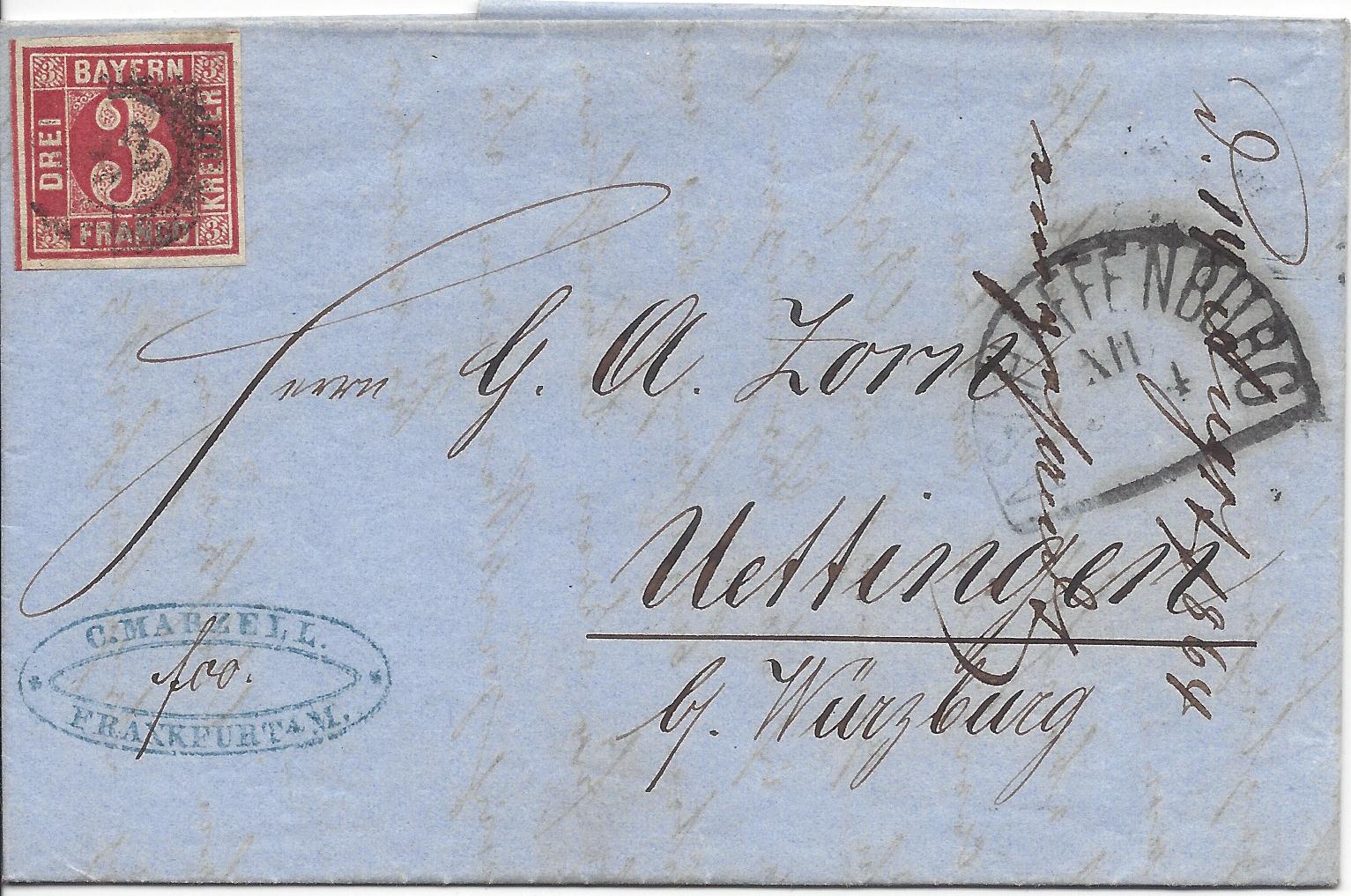
Here's
a cover that was mailed in Bavaria (also a member of GAPU). If you
look at the blue marking at the lower left, you will see some hand
writing that DOES look a bit lit "foo." It is, in fact, "fco" for
"franco" once again.
As a person who has a background in software engineering, I have to admit that the first time I saw script markings like this, I was a bit surprised that foo was being used. There have been many times that I have looked at programming code and found variables named "foo" and "bar." It wasn't until I asked German postal historians (thank you Ralph and Tim) about this a few years ago that I realized I was missing the point entirely.
This got me to thinking about all of the things in postal history and philately (stamp collecting) that I would have missed if it weren't for others sharing what they know in one fashion or another.

Here is an 1863 folded letter that started in Livorno, Italy, and traveled to Malta as its final destination. A postage stamp representing the payment of 40 centesimi for a simple letter weighing no more than 7.5 grams appears at the top left and a "P.D." marking indicates that the letter is considered paid in full.
That's all interesting enough, but it's actually the neat words written in pencil at the top that caught my notice. "Doppia effigie" which translates to "double effigy." This was clearly written by a previous collector or dealer to alert future members of the hobby that something else is going on that might be easy to miss.
And, on the back is further information in pencil - this time in English. "Sardinia, double emboss."

First of all, I am not a fan of any additional collector notations on the front of an item. So, I would have preferred to see that first notation on the back. Second, if there are to be notations, they need to be brief, accurate and applied lightly in pencil. Why pencil? Because sometimes the notations aren't entirely accurate and new information might uncover that fact. I have also been dismayed to find covers that had so much writing on them by a collector or dealer that some of the original postal markings that tell the story of the item are endanger of being covered up.
With that aside... here is what both of these notations were trying to get us all to look at.
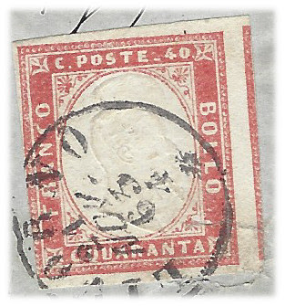
On this particular issue of postage stamp, the image of Victor Emmanuel II (King of Italy at the time) was embossed onto the stamp rather than printed in ink. Embossing simply means the image was impressed into the paper by pushing the design into it.
The notations are telling us to look for TWO images of Victor Emmanuel's head on this stamp. Do you see them?

This got me to start thinking about things I still hope to learn more about. Which led me to this cover:

When I first picked this item up, I figured it to be a simple letter between two locations in Portugal. But, it turns out that Porto (or Oporto) is in Portugal and Villagarcia is in northwestern Spain.
Normally, I would be looking at clues like the French "P.D." or the German "Franco" to alert me to the fact that the letter crossed borders. Well, there is no such thing on the front of this letter, but it turns out the answer was in front of me the whole time.

The docket at the top left reads "Hespanha," which would be Portuguese for "Spain."
This is one of the beautiful things about the postal history hobby. If you allow yourself to explore areas away from your home or outside your comfort area, you can be reminded that for all of our similarities, there are differences, and for all of our differences, there are similarities.
It is also a good reminder to me that it is absurd for me to think that I should automatically know anything if I have never experienced it before. How should I expect to know that the letters on an envelope were "fco" and not "foo" and how would my brain pick out the word "Hespanha" and know that referenced the land I recognize as "Spain" unless I give myself an opportunity to learn these things?

So, how did I learn that this word was "Hespanha" in the first place?
It started on the back of this folded letter. You can see the following markings that tell the story of the travels this letter took:
- Porto, Portugal - Sep 2
- Valenca, Portugal - Sep 3
- Tui, Spain - Sep 3 or 4
- Villagarcia, Spain - Sep 4
First of all, it seemed odd to me that an internal letter in Portugal would require so many transit markings on the back. I suppose it could be possible that the Portuguese were more concerned with tracking their mail than the French - but I didn't think that was the case. I found it more likely that the extra markings had to do with the exchange process of mail between two postal services. So, I started doing some map searching and this is what I found.

Valenca and Tui are both very near the border between Portugal and Spain, so they were clearly a good place for mail to be exchanged between countries. The other clue was that the Villagarcia postmark reads "Villagarcia Pontevedra." Pontevedra is a province in Galicia, which is northwest Spain. So, my salvation came with some knowledge of geography and a willingness to explore period maps. It had much less to do with language.
But, once I realized this was destined to
leave Portugal, that roused my suspicions that the docket must have
something to do with telling the postal service in Portugal more about
the destination. And that brings us full-circle back to Hespanha. Now
that we all have access to translation software, I was able to do some
exploring to find my answer.
And there you are! This is where
my mind wanders as I do a simple organizing task. This probably
explains why one of my favorite sayings is "thinking is a dangerous
pastime."
Rob, your comment about the "franco" not being a GAPU requirement helps me better understand why 1 out of 2 covers in my collection - both Denmark to DWI via London in 1869 sent 1 month apart - has a franco stamp and the other doesn't. I thought it may have something to do with routing. For example if one of the 2 covers went by train from Denmark-Ostende-London got the franco stamp vs. going by ship directly Hamburg-London which received no marking. My understanding is that all mail went by train on this routing as it was faster in this era.
ReplyDeleteGreat content as usual!
Mason
Mason, actually, the comment I make would be specific to internal GAPU mail. Specific treaty or convention arrangements might, in fact, place a requirement depending on the route. This is why there is commonly a rectangular marking that reads "Aachen Franco" from mail from the US to GAPU via Prussian Closed Mail in the 1860s. This was part of the agreed upon terms for mail exchanged between countries (US and Prussia/GAPU). Your Denmark-Ostende-London route may very well have gone through Aachen (and thus Prussian mail) which would explain the appearance of the "franco." So, you were on track originally. This encourages me to read what I wrote to see if I can clarify it further. Many thanks! Rob
DeleteThanks Rob, Was just looking at a 3rd 1869 cover Denmark-London and it too has no boxed Franco marking. Oddly the specialist books I have don't really speak to why some letters with the same origin-destination got the boxed Franco and others did not. The journey continues...
ReplyDeleteMason, stay in touch, we can help each other out as we both journey. Best, as always! Rob
Delete